| Creating Graphical User Interfaces | |
The Layout Editor component palette contains the user interface controls that you can use in your GUI. These components are MATLAB uicontrol objects and are programmable via their Callback properties. This section provides an overview of these components.
Push Buttons
Push buttons generate an action when pressed (e.g., an OK button may close a dialog box and apply settings). When you click down on a push button, it appears depressed; when you release the mouse, the button's appearance returns to its nondepressed state; and its callback executes on the button up event.
Toggle Buttons
Toggle buttons generate an action and indicate a binary state (e.g., on or off). When you click on a toggle button, it appears depressed and remains depressed when you release the mouse button, at which point the callback executes. A subsequent mouse click returns the toggle button to the nondepressed state and again executes its callback.
The callback routine needs to query the toggle button to determine what state it is in. You can do this with a statement that uses the current callback object's handle (gcbo).
get(gcbo,'Value')
MATLAB sets the Value property to the value of the Max property when the toggle button is depressed (1 by default) and the value of the Min property when the toggle button is not depressed (0 by default).
Adding an Image to a Push Button or Toggle Button
Assign the CData property an m-by-n-by-3 array of RGB values that define a truecolor image. For example, the array a defines 16-by-128 truecolor image using random values between 0 and 1 (generated by rand).
a(:,:,1) = rand(16,128);
a(:,:,2) = rand(16,128);
a(:,:,3) = rand(16,128);
set(h,'CData',a)
Radio Buttons
Radio buttons are similar to check boxes, but are intended to be mutually exclusive within a group of related radio buttons (i.e., only one button is in a selected state at any given time). To activate a radio button, click the mouse button on the object. The display indicates the state of the button.
Implementing Mutually Exclusive Behavior
Radio buttons have two states - selected and not selected. You can query and set the state of a radio button through its Value property:
Value = Max, button is selected.Value = Min, button is not selected.To make radio buttons mutually exclusive within a group, the callback for each radio button must set the Value property to 0 on all other radio buttons in the group. MATLAB sets the Value property to 1 on the radio button clicked by the user.
The following subfunction, when added to the application M-file, can be called by each radio button callback. The argument is an array containing the handles of all other radio buttons in the group that must be deselected.
function mutual_exclude(off)
set(off,'Value',0)
Obtaining the Radio Button Handles. The handles of the radio buttons are available from the handles structure, which contains the handles of all components in the GUI. This structure is an input argument to all radio button callbacks.
The following code shows the call to mutual_exclude being made from the first radio button's callback in a group of four radio buttons.
function varargout = radiobutton1_Callback(h,eventdata,handles,varargin)
off = [handles.radiobutton2,handles.radiobutton3,handles.radiobutton4];
mutual_exclude(off)
% Continue with callback
    .
    .
    .
After setting the radio buttons to the appropriate state, the callback can continue with its implementation-specific tasks.
Checkboxes
Check boxes generate an action when clicked and indicate their state as checked or not checked. Check boxes are useful when providing the user with a number of independent choices that set a mode (e.g., display a toolbar or generate callback function prototypes).
The Value property indicates the state of the check box by taking on the value of the Max or Min property (1 and 0 respectively by default):
Value = Max, box is checked.Value = Min, box is not checked.You can determine the current state of a check box from within its callback by querying the state of its Value property, as illustrated in the following example:
function checkbox1_Callback(h,eventdata,handles,varargin)
if (get(h,'Value') == get(h,'Max'))
    then checkbox is checked-take approriate action
else
    checkbox is not checked-take approriate action
end
Edit Text
Edit text controls are fields that enable users to enter or modify text strings. Use edit text when you want text as input. The String property contains the text entered by the user.
Triggering Callback Execution
On UNIX systems, clicking on the menubar of the figure window causes the edit text callback to execute. However, on Microsoft Windows systems, if an editable text box has focus, clicking on the menubar does not cause the editable text callback routine to execute. This behavior is consistent with the respective platform conventions. Clicking on other components in the GUI execute the callback.
Static Text
Static text controls displays lines of text. Static text is typically used to label other controls, provide directions to the user, or indicate values associated with a slider. Users cannot change static text interactively and there is no way to invoke the callback routine associated with it.
Sliders accept numeric input within a specific range by enabling the user to move a sliding bar. Users move the bar by pressing the mouse button and dragging the slide, by clicking in the trough, or by clicking an arrow. The location of the bar indicates a numeric value.
Slider Orientation
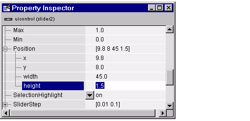
You can orient the slider either horizontally or vertically by setting the relative width and height of the Position property.
For example, these settings create a horizontal slider.
Current Value, Range, and Stepsize
There are four properties that control the range and step size of the slider:
Value - contains the current value of the slider.Max - defines the maximum slider value.Min - defines the minimum slider value.SliderStep - specifies the size of a slider step with respect to the range.The Value property contains the numeric value of the slider. You can set this property to specify an initial condition and query it in the slider's callback to obtain the value set by the user. For example, your callback could contain the statement.
slider_value = get(handles.slider1,'Value');
The Max and Min properties specify the slider's range (Max - Min).
The SliderStep property controls the amount the slider Value property changes when you click the mouse on the arrow button or on the slider trough. Specify SliderStep as a two-element vector. The default, [0.01 0.10], provides a 1 percent change for clicks on an arrow and a 10 percent change for clicks in the trough. The actual step size is a function of the slider step and the slider range.
Designing a Slider
Suppose you want to create a slider with the following behavior:
From these values you need to determine and set the Max, Min, SliderStep, and Value properties. You can do this by adding the following code to the initialization section of the application M-file (after the creation of the handles structure).
slider_step(1) = 0.4/(8-5);
slider_step(2) = 1/(8-5);
set(handles.slider1,'sliderstep',slider_step,...
      'max',8,'min',5,'Value',6.5)
Triggering Callback Execution
The slider callback is executed when the user releases the mouse button.
Frames
Frames are boxes that enclose regions of a figure window. Frames can make a user interface easier to understand by visually grouping related controls. Frames have no callback routines associated with them and only uicontrols can appear within frames (axes cannot).
Frames are opaque. If you add a frame after adding components that you want to be positioned within the frame, you need to bring forward those components. Use the Bring to Front and Send to Back operations in the Layout menu for this purpose.
List boxes display a list of items (defined using the String property) and enable users to select one or more items. The Value property contains the index into the list of strings that correspond to the selected item. If the user selected multiple items, then Value is a vector of indices. The first item in the list has an index of 1.
By default, the first item in the list is highlighted when the list box is first displayed. If you do not want any item highlighted, then set the Value property to empty, [].
Single or Multiple Selection
The values of the Min and Max properties determine whether users can make single or multiple selections:
Max - Min > 1, then list boxes allow multiple item selection. Max - Min <= 1, then list boxes do not allow multiple item selection.Selection Type
List boxes differentiate between single and double clicks on an item and set the figure SelectionType property to normal or open accordingly. See Triggering Callback Execution for information on how to program multiple selection.
Triggering Callback Execution
MATLAB evaluates the list box's callback routine after any mouse button up or keypress event (including arrow keys) that changes the Value property (i.e., any time the user clicks on an item, but not when clicking on the list box scrollbar). This means the callback is executed after the first click of a double-click on a single item or when the user is making multiple selections.
In these situations, you need to add another component, such as a "Done" button (push button) and program its callback routine to query the list box Value property (and possibly the figure SelectionType property) instead of creating a callback for the list box. If you are using the automatically generated application M-file option, you need to either:
Callback property to the empty string ('') and remove the callback subfunction from the application M-file.disp statement so that no code is executed when users click on list box items. The first choice is best if you are sure you will not use the list box callback and you want to minimize the size and efficiency of the application M-file. However, if you think you may want to define a callback for the list box at some time, it is simpler to leave the callback stub in the M-file.
List Box Examples
See the following examples for more information on using list boxes:
Popup Menus
Popup menus open to display a list of choices (defined using the String property) when users press the arrow. When not open, a popup menu displays the current choice, which is determined by the index contained in the Value property. The first item in the list has an index of 1. You can query the Value property in the callback routine to determine which choice the user made.
Popup menus are useful when you want to provide users with a number of mutually exclusive choices, but do not want to take up the amount of space that a series of radio buttons requires.
| | Defining Context Menus | Enable or Disabling Controls | |