

| Curve Fitting Toolbox | |
Viewing Data
The Curve Fitting Toolbox provides two ways to view imported data:
Viewing Data Graphically
After you import a data set, it is automatically displayed as a scatter plot in the Curve Fitting Tool. The response data is plotted on the vertical axis and the predictor data is plotted on the horizontal axis.
The scatter plot is a powerful tool because it allows you to view the entire data set at once, and it can easily display a wide range of relationships between the two variables. You should examine the data carefully to determine whether preprocessing is required, or to deduce a reasonable fitting approach. For example, it's typically very easy to identify outliers in a scatter plot, and to determine whether you should fit the data with a straight line, a periodic function, a sum of Gaussians, and so on.
Enhancing the Graphical Display
The Curve Fitting Toolbox provides several tools for enhancing the graphical display of a data set. These tools are available through the Tools menu, the GUI toolbar, and right-click menus.
You can zoom in, zoom out, display data and fit tips, and so on using the Tools menu and the GUI toolbar shown below.
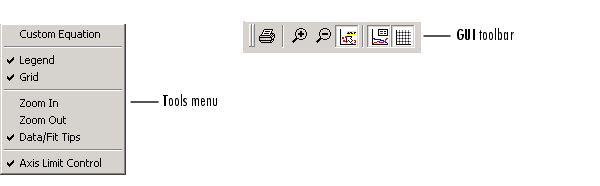
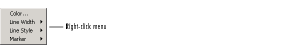
You can change the color, line width, line style, and marker type of the displayed data points using the right-click menu shown below. You activate this menu by placing your mouse over a data point and right-clicking. Note that a similar menu is available for fitted curves.
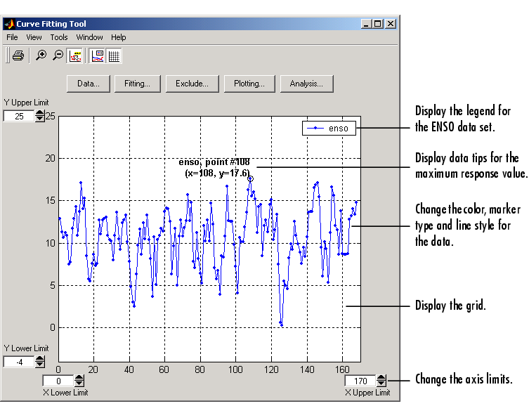
The ENSO data is shown below after the display has been enhanced using several of these tools.
Viewing Data Numerically
You can view the numerical values of a data set, as well as data points to be excluded from subsequent fits, with the View Data Set GUI. You open this GUI by selecting a name in the Data sets list box of the Data GUI and clicking the View button. The View Data Set GUI for the ENSO data set is shown below, followed by a description of its features.
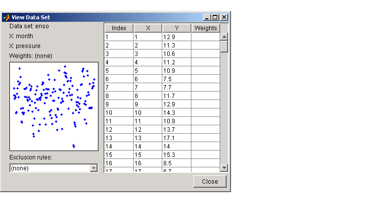
Infs or NaNs, those values are labeled "ignored." If the data contains complex numbers, only the real part is displayed.
| | Example: Importing Data | Smoothing Data | |