| Curve Fitting Toolbox | |
Plot data, fit, prediction bounds, outliers, and residuals
Syntax
plot(fresult)
plot(fresult,xdata,ydata)
plot(fresult,xdata,ydata,'s')
plot(fresult,'s1',xdata,ydata,'s2')
plot(fresult,xdata,ydata,outliers)
plot(fresult,xdata,ydata,outliers,'s')
plot(...,'ptype1','ptype2',...)
plot(...,'ptype1','ptype2',...,conflev)
h = plot(...)
Arguments
Description
plot(fresult)
plots the fit result object fresult. fresult is a fit result object generated by the fit function.
plot(fresult,xdata,ydata)
plots the fit result object, the predictor data specified by xdata, and the response data specified by ydata.
plot(fresult,xdata,ydata,'s')
plots the predictor and response data using the color, symbol, and line type specified by the string s. Refer to the built-in plot function for color, symbol, and line type options.
plot(fresult,'s1',xdata,ydata,'s2')
plots the fit result object using the color, symbol, and line type specified by the string s1, and plots the predictor and response data using the color, symbol, and line type specified by the string s2.
plot(fresult,xdata,ydata,outliers)
plots the outliers specified by outliers in a different color. outliers must be the same size as xdata and ydata. You identify data points as outliers with the excludedata function.
plot(fresult,xdata,ydata,outliers,'s')
plots the outliers using the color, symbol, and line type specified by the string s.
plot(...,' plots the plot types specified by ptype1','ptype2',...)
ptype1, ptype2, and so on. ptype can be a single plot type or multiple plot types, which you can specify as a cell array of strings. For one plot type or none (the default), plot behaves like the built-in plot command and draws into the current figure and axes. This way, you can use commands like subplot and hold to arrange plots in a figure window and to superimpose multiple fits into the same graph. For multiple plot types, plot uses subplot to create one set of axes per plot type. The supported plot types are given below.
plot(...,' plots prediction bounds with the confidence level specified by ptype1','ptype2',...,conflev)
conflev. conflev must be between 0 and 1. The default value is 0.95 for 95% confidence levels.
h = plot(...)
returns a vector of handles to h.
Remarks
To plot error bars, use the errorbar function. For example, if you have a vector of weights w (reciprocal variances) associated with the response data ydata, you can plot symmetric error bars with the following command.
Example
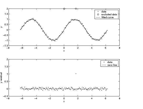
Create a noisy sine wave on the interval [-2 , 2] and add two outliers with the value 2.
rand('state',2);
x = (-2*pi:0.1:2*pi)';
y = sin(x) + (rand(size(x))-0.5)*0.2;
y(ceil(length(x)*rand(2,1))) = 2;
Identify outliers that are outside the interval [-1.5, 1.5] using the range method.
Create a custom fit type, define fit options that exclude the outliers from the fit and define reasonable starting values, and fit the data.
ftype = fittype('a*sin(b*x)');
opts = fitoptions('Method','NonLinear','excl',outliers,...
'Start',[1 1]);
fit1 = fit(x,y,ftype,opts);
Plot the data, the fit to the data, and mark the outliers.
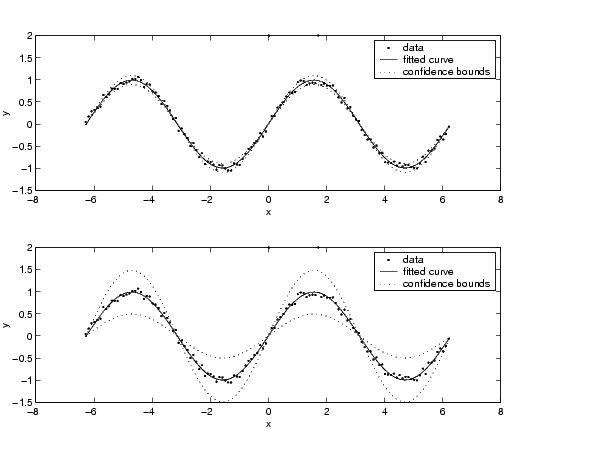
Plot 99% confidence and prediction bounds for the function and for a new observation.
See Also
errorbar, plot (built-in), subplot
| | integrate | predint | |